
Wednesday, 14 January, 2026г.


Где искать: по сайтам Запорожской области, статьи, видео ролики
пример: покупка автомобиля в Запорожье
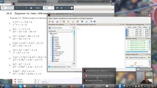
Scilab - How to plot 2D graphs (Simple Plotting)
 У вашего броузера проблема в совместимости с HTML5
You can use Scilab not only to calculate quantites, but to plot them as well. In this video we'll do only simple x-y plots.
Producing plots and graphics is a very common task for analysing data and creating reports. Scilab offers many ways to create and customize various types of plots and charts. In this section, we present how to create 2D plots and contour plots. Then we customize the title and the legend of our graphics. We finally export the plots so that we can use it in a report.
=======================================================
Other resources on SciLab from WeMakeItEasy
Introduction to basic SciLab operators: https://www.youtube.com/watch?v=H_aD_ZBUTW0
Теги:
simple plotting scilab plotting scilab plotting tutorial scilab plotting graphs scilab plot function Tutorial Scilab How to plot 2D graphs scilab tutorial Incredibly simple tutorial simplest way for ploting in Scilab plotting in Scilab simulation in Scilab plotting functionality in Scilab plotting Plotting in Scilab
Похожие видео


Мой аккаунт