
Wednesday, 14 January, 2026г.


Где искать: по сайтам Запорожской области, статьи, видео ролики
пример: покупка автомобиля в Запорожье
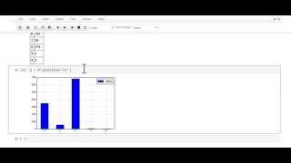
Pandas Plot - How to Create a Basic Pandas Visualization
 У вашего броузера проблема в совместимости с HTML5
In this video we will learn how to create a basic pandas plot. Click on this video to learn why MatPlotLib is Python's default charting library and how it is used to create Pandas visualizations.
What is Pandas? A Python data analysis library
The video starts out by creating a small dataframe. This dataframe will only have one column called "hello" and a few rows containing integers. We then introduce the "%matplotlib inline" command. This is actually a Jupyter magic function that allows the matplotlib charts to appear in the notebook. Without this magic function, you will only get a chart object but no picture.
Now that we are all set up, we can then apply the .plot() function to our dataframe. The reader will then notice that along with the plot, you also get that annoying matplotlib object. This video shows you the easy trick to remove the chart object.
We will also go over how to generate bar charts and how to customize the size of your pandas visualization.
Advanced plotting is also touched upon. The video shows you how to add a chart title, change the title font size, label the X/Y axis, and add a legend. There is also a parameter in the .plot() function that sets the plot color of the line chart.
Where can I find the Pandas tutorials for new users?
http://www.hedaro.com/pandas-tutorial
Похожие видео


Мой аккаунт