
Tuesday, 13 January, 2026г.


Где искать: по сайтам Запорожской области, статьи, видео ролики
пример: покупка автомобиля в Запорожье
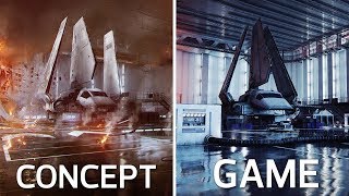
Concept Art vs Final In-Game Images | Battlefront II Comparison
 У вашего броузера проблема в совместимости с HTML5
Quick reminder that some lighting and such doesn't look as good as it usually would in game due to the fact that I am going outside their render regions in some photos. Also remember that this is just concept art and not representative of what the final product is supposed to look like. It is created as a reference for the game artists.
I was curious to see how close the concept art compared to the final in game layouts. So here are some photo comparisons.
First image is always the concept art, and the second is the in game shot.
The Extremely Talented Concept Artists:
Anton Grandert: https://www.artstation.com/antongrandert
Joseph McLamb: https://www.artstation.com/joemclamb
Mathieu Latour-Duhaime: https://www.artstation.com/matlat
Sigurd Fernstrom: https://www.artstation.com/fernstrom
Darius Kalinauskas: https://www.artstation.com/dariusk
Esbjörn Nord: https://www.artstation.com/esbjornnord
Music: Battlefront II Campaign
If you enjoy my content and want to support the channel, please consider donating through patreon
https://www.patreon.com/Cinematicaptures
Теги:
Screenshots Battlefront Captures Star Wars Cinematic Tools Art Concept Concept Art Battlefront II The Art of Battlefront II Behind the scenes BTS Artstation Paintings Game Development
Похожие видео
Мой аккаунт