Tuesday, 13 January, 2026г.


Где искать: по сайтам Запорожской области, статьи, видео ролики
пример: покупка автомобиля в Запорожье
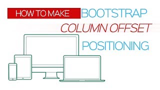
Bootstrap Grid Column offset - Tutorial for Beginners
How to make bootstrap column offset tutorial for beginners by Learning Simplified - shift contents right to your browser responsive website making.
======================================================
In this tutorial we have discussed how to make columns offset from its previous position. We may shift them right any time using a specific class col-lg-offset-3 and make modification on Bootstrap grid layout. Now here comes the argument, up to which extent? We know that bootstrap grid system practically divides your device width into twelve grids.We must make sure that this summation is kept intact, i.e., total no. of grids consumed + total number of column offset should not exceed maximum number of grids, i.e., 12.
Another thing that is discussed here, is the approach. We may put our contents inside a Bootstrap container using two separate rows, or we may put them in different containers. Academically, both approaches are alright and there's no problem. But we must consider the Industrial approach. If we use separate containers for separate contents, there's always a scope to make use of 'em for future purpose with separate IDs. This is a vital scope for disintegration your contents into macro parts instead of keeping them into a single one. It will be relatively easier to provide separate properties for same class names used in Bootstrap. We will come to see the effects in later tutorials.
The last vital thing analyzed here is - Utilization of empty spaces for future references. Change is the only constant. If project demands for future modifications it will be made at ease if provisions are made in the first place. That is why, instead
of using column offset class, it would be wise thing to make the same arrangement with grid allocation. It is been analyzed here with merits and demerits.
In short, things those are covered here are:
1) Introduction to offset command and possible usage with larger
device preview
2) Best practice to put contents inside bootstrap container, rows
and class names
3) Best practice to utilize all the 12 grids present inside Bootstrap
container.
Let's have a look at the tutorial.
====================================================
Stay tuned to our channel to learn more:
https://www.youtube.com/channel/UCNBuByD9iIgqElwmIIqoIiA
=====================================================
Watch for relevant blogs at :
http://learnsimple1987.blogspot.in/
=====================================================
Our G+ profile is at:
https://plus.google.com/u/0/b/108616648678138902856/108616648678138902856
=====================================================
Twit us at:
https://twitter.com/learnmaniac1987
=====================================================
watch us at facebook :
https://www.facebook.com/learnmaniac1987/
======================================================
Thanks in advance for viewing it. If you liked the tutorial, do not hesitate to hit the red SUBSCRIBER button to stay tuned for more in future.
-~-~~-~~~-~~-~-
Please watch: "JavaScript Tutorial for Beginners #12- Make a Basic Calculator"
https://www.youtube.com/watch?v=Y0rmLwq4nto
-~-~~-~~~-~~-~-
Теги:
bootstrap grid system bootstrap grid bootstrap offset bootstrap column offset grid offset bootstrap container bootstrap column offset tutorial for beginners bootstrap layout bootstrap grid layout Learning simplified how to make Bootstrap Grid column offset Tutorial Bootstrap container padding Bootstrap for Beginners tutorial bootstrap columns how to bootstrap grid column offset - tutorial for beginners column offset container bootstrap
Похожие видео
Мой аккаунт


 У вашего броузера проблема в совместимости с HTML5


