
Wednesday, 14 January, 2026г.


Где искать: по сайтам Запорожской области, статьи, видео ролики
пример: покупка автомобиля в Запорожье
18. a) Charts Part 1: Bar, line, Combo, Pi, Scatter, Box Plot in Qlik Sense
 У вашего броузера проблема в совместимости с HTML5
Hi everyone, we will be discussing the below :
1. Bar Chart:
When you have one or more measures and one dimension
Ex.
a) Actual vs. budget- money to money. Quarter to Quarter
b) Sum/avg of runs of each players
2. Line chart:
When you have a trending data, like sum of sales over the months.
Basically the data keeps moving over the dimension taken
Ex. a) Performance trends- amount of moment over time
It is also used when you want to compare two dimensions over a trend
Two Dimension comparisons- Annual comparisons over month
3. Combo Charts:
Comparisons for multiple measurements
Ex: Average of sales and avg of budget over the year
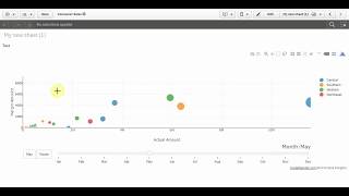
4. Box Plot
The box plot is suitable for comparing range and distribution for groups of numerical data
For more videos please visit: https://www.youtube.com/watch?v=RN-xRgP0oL4&list=PLSFb2_aycoM0yypiK9KlML0Tgsk8KAetn&index=2&t=39s
Please follow me on:
LinkedIn: linkedin.com/in/biswadeep-moitra-98137079
Gmail: [email protected]
Facebook: https://www.facebook.com/biswadeep.moitra
Instagram: https://www.instagram.com/biswadeep_moitra/
Теги:
Qlik 2 Express Qlik2Express Qlik to Express Click 2 Express Click to Express bar chart Pi chart Scatter chart box plot chart qlik sense chsrt charts is qlik sense charts chart
Похожие видео


Мой аккаунт