
Tuesday, 13 January, 2026г.


Где искать: по сайтам Запорожской области, статьи, видео ролики
пример: покупка автомобиля в Запорожье
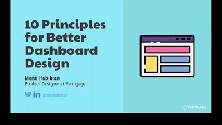
10 Principles for Better Dashboard Design | DZone.com Webinar
 У вашего броузера проблема в совместимости с HTML5
Are your application’s dashboards, reports, and other analytics features both visually engaging and useful? If not, people may not bother to use them.
To build compelling analytics, you need to know your audience, prioritize your goals, and tell a clear story. Join Mana Habibian, product designer at Venngage, as she dives into 10 key dashboard design principles. What visualizations should you use for your dataset? Do colors matter? How many charts should you put on one screen? Discover tips you can follow to improve your dashboard design today.
About DZone
DZone.com, a Devada Media Property, is a hub of articles and tutorials written by software developers for software developers. Learn more about what’s trending in software development and get tutorials on top tech products by watching our latest videos and webinars.
Interested in hosting a webinar, go to https://devada.com/dzone/advertise.
Follow us on Twitter: https://twitter.com/DZoneInc
Like us on Facebook: https://www.facebook.com/DZoneInc/
Теги:
analytics dashboard design Venngage visualization Devada DZone AnswerHub developers developer community
Похожие видео


Мой аккаунт